一套好看的登录注册静态html页面
2019-12-09 09:40:24
788
先看下效果图


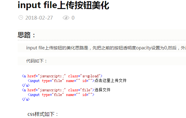
HTML代码如下:
<!DOCTYPE html>
<html>

<head>
<meta charset="utf-8">
<title>左右过度切换的登录注册页面演示</title>
<link rel="stylesheet" href="static/css/style.css">
</head>

<body>
    <div>
        <div class="form sign-in">
            <h2>欢迎回来</h2>
            <label>
                <span>邮箱</span>
                <input type="email" />
            </label>
            <label>
                <span>密码</span>
                <input type="password" />
            </label>
            <p><a href="javascript:">忘记密码?</a></p>
            <button type="button">登 录</button>
            <button type="button">使用 <span>facebook</span> 帐号登录</button>
        </div>
        <div>
            <div>
                <div class="img__text m--up">
                    <h2>还未注册?</h2>
                    <p>立即注册,发现大量机会!</p>
                </div>
                <div class="img__text m--in">
                    <h2>已有帐号?</h2>
                    <p>有帐号就登录吧,好久不见了!</p>
                </div>
                <div>
                    <span>注 册</span>
                    <span>登 录</span>
                </div>
            </div>
            <div class="form sign-up">
                <h2>立即注册</h2>
                <label>
                    <span>用户名</span>
                    <input type="text" />
                </label>
                <label>
                    <span>邮箱</span>
                    <input type="email" />
                </label>
                <label>
                    <span>密码</span>
                    <input type="password" />
                </label>
                <button type="button">注 册</button>

            </div>
        </div>
    </div>

    <script src="static/js/script.js"></script>
</body>

</html>
style.css代码如下:
*, *:before, *:after {
    box-sizing: border-box;
    margin: 0;
    padding: 0;
}

body {
    font-family: 'Open Sans', Helvetica, Arial, sans-serif;
    background: #ededed;
}

input, button {
    border: none;
    outline: none;
    background: none;
    font-family: 'Open Sans', Helvetica, Arial, sans-serif;
}

.tip {
    font-size: 20px;
    margin: 40px auto 50px;
    text-align: center;
}

.content {
    overflow: hidden;
    position: absolute;
    left: 50%;
    top: 50%;
    width: 900px;
    height: 550px;
    margin: -300px 0 0 -450px;
    background: #fff;
}

.form {
    position: relative;
    width: 640px;
    height: 100%;
    transition: -webkit-transform 0.6s ease-in-out;
    transition: transform 0.6s ease-in-out;
    transition: transform 0.6s ease-in-out, -webkit-transform 0.6s ease-in-out;
    padding: 50px 30px 0;
}

.sub-cont {
    overflow: hidden;
    position: absolute;
    left: 640px;
    top: 0;
    width: 900px;
    height: 100%;
    padding-left: 260px;
    background: #fff;
    transition: -webkit-transform 0.6s ease-in-out;
    transition: transform 0.6s ease-in-out;
    transition: transform 0.6s ease-in-out, -webkit-transform 0.6s ease-in-out;
}

.content.s--signup .sub-cont {
    -webkit-transform: translate3d(-640px, 0, 0);
    transform: translate3d(-640px, 0, 0);
}

button {
    display: block;
    margin: 0 auto;
    width: 260px;
    height: 36px;
    border-radius: 30px;
    color: #fff;
    font-size: 15px;
    cursor: pointer;
}

.img {
    overflow: hidden;
    z-index: 2;
    position: absolute;
    left: 0;
    top: 0;
    width: 260px;
    height: 100%;
    padding-top: 360px;
}

.img:before {
    content: '';
    position: absolute;
    right: 0;
    top: 0;
    width: 900px;
    height: 100%;
    background-image: url(../images/bg.jpg);
    background-size: cover;
    transition: -webkit-transform 0.6s ease-in-out;
    transition: transform 0.6s ease-in-out;
    transition: transform 0.6s ease-in-out, -webkit-transform 0.6s ease-in-out;
}

.img:after {
    content: '';
    position: absolute;
    left: 0;
    top: 0;
    width: 100%;
    height: 100%;
    background: rgba(0, 0, 0, 0.6);
}

.content.s--signup .img:before {
    -webkit-transform: translate3d(640px, 0, 0);
    transform: translate3d(640px, 0, 0);
}

.img__text {
    z-index: 2;
    position: absolute;
    left: 0;
    top: 50px;
    width: 100%;
    padding: 0 20px;
    text-align: center;
    color: #fff;
    transition: -webkit-transform 0.6s ease-in-out;
    transition: transform 0.6s ease-in-out;
    transition: transform 0.6s ease-in-out, -webkit-transform 0.6s ease-in-out;
}

.img__text h2 {
    margin-bottom: 10px;
    font-weight: normal;
}

.img__text p {
    font-size: 14px;
    line-height: 1.5;
}

.content.s--signup .img__text.m--up {
    -webkit-transform: translateX(520px);
    transform: translateX(520px);
}
.img__text.m--in {
    -webkit-transform: translateX(-520px);
    transform: translateX(-520px);
}

.content.s--signup .img__text.m--in {
    -webkit-transform: translateX(0);
    transform: translateX(0);
}

.img__btn {
    overflow: hidden;
    z-index: 2;
    position: relative;
    width: 100px;
    height: 36px;
    margin: 0 auto;
    background: transparent;
    color: #fff;
    text-transform: uppercase;
    font-size: 15px;
    cursor: pointer;
}
.img__btn:after {
    content: '';
    z-index: 2;
    position: absolute;
    left: 0;
    top: 0;
    width: 100%;
    height: 100%;
    border: 2px solid #fff;
    border-radius: 30px;
}

.img__btn span {
    position: absolute;
    left: 0;
    top: 0;
    display: flex;
    justify-content: center;
    align-items: center;
    width: 100%;
    height: 100%;
    transition: -webkit-transform 0.6s;
    transition: transform 0.6s;
    transition: transform 0.6s, -webkit-transform 0.6s;
}

.img__btn span.m--in {
    -webkit-transform: translateY(-72px);
    transform: translateY(-72px);
}

.content.s--signup .img__btn span.m--in {
    -webkit-transform: translateY(0);
    transform: translateY(0);
}

.content.s--signup .img__btn span.m--up {
    -webkit-transform: translateY(72px);
    transform: translateY(72px);
}

h2 {
    width: 100%;
    font-size: 26px;
    text-align: center;
}

label {
    display: block;
    width: 260px;
    margin: 25px auto 0;
    text-align: center;
}

label span {
    font-size: 12px;
    color: #909399;
    text-transform: uppercase;
}

input {
    display: block;
    width: 100%;
    margin-top: 5px;
    padding-bottom: 5px;
    font-size: 16px;
    border-bottom: 1px solid rgba(0, 0, 0, 0.4);
    text-align: center;
}

.forgot-pass {
    margin-top: 15px;
    text-align: center;
    font-size: 12px;
    color: #cfcfcf;
}

.forgot-pass a {
    color: #cfcfcf;
}

.submit {
    margin-top: 40px;
    margin-bottom: 20px;
    background: #d4af7a;
    text-transform: uppercase;
}

.fb-btn {
    border: 2px solid #d3dae9;
    color: #8fa1c7;
}
.fb-btn span {
    font-weight: bold;
    color: #455a81;
}

.sign-in {
    transition-timing-function: ease-out;
}
.content.s--signup .sign-in {
    transition-timing-function: ease-in-out;
    transition-duration: 0.6s;
    -webkit-transform: translate3d(640px, 0, 0);
    transform: translate3d(640px, 0, 0);
}

.sign-up {
    -webkit-transform: translate3d(-900px, 0, 0);
    transform: translate3d(-900px, 0, 0);
}
.content.s--signup .sign-up {
    -webkit-transform: translate3d(0, 0, 0);
    transform: translate3d(0, 0, 0);
}
script.js如下
document.querySelector('.img__btn').addEventListener('click', function() {
    document.querySelector('.content').classList.toggle('s--signup')
})